Katharina Grosse
 © Andrea Stappert
Katharina Grosse, o.T., 2003
Foto: Sebastian Schobbert © Katharina Grosse / VG Bild-Kunst Bonn, 2021

Katharina Grosse, o.T., 2003
Foto: Sebastian Schobbert © Katharina Grosse / VG Bild-Kunst Bonn, 2021

Katharina Grosse, o.T., 2003
Foto: Sebastian Schobbert © Katharina Grosse / VG Bild-Kunst Bonn, 2021

Katharina Grosse, o.T., 2003
Foto: Sebastian Schobbert © Katharina Grosse / VG Bild-Kunst Bonn, 2021

Katharina Grosse, o.T., 2003
Foto: Sebastian Schobbert © Katharina Grosse / VG Bild-Kunst Bonn, 2021

Katharina Grosse, o.T., 2003
Foto: Sebastian Schobbert © Katharina Grosse / VG Bild-Kunst Bonn, 2021

Enrico Castellani
In 1959, using a regular, geometric arrangement of hazelnuts across which he stretched a monochrome canvas, Enrico Castellani established the fundamental ...
read more 
Gotthard Graubner
“It is by lending his body to the world that the painter transforms the world into painting,”1 writes the philosopher Maurice Merleau-Ponty. The painter ...
read more 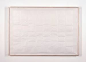
Oskar Holweck
Bending, creasing, crumpling, folding, pressing, squeezing, stretching, scoring, tearing, slitting, cutting, sawing, singeing, burning – using various ...
read more 
Mark Tobey
In his picture series White Writings, Mark Tobey creates labyrinthine rhizomatic entanglements out of repetitive, white brushstrokes on dark backgrounds. ...
read more Lucio Fontana
The museum is a conventional institution. Equally conventional is the practice of giving introductory talks at exhibition openings. We won’t waste our ...
read more 
Roman Opalka, Opalka 1965/1–∞
“Like a mountaineer, stage by stage I climb the rock face of a high mountain from whose summit I hope to discover an unlimited horizon of endless white. ...
read more 
Frank Badur
Frank Badur’s pictures require the viewer to surrender to the beauty of simplicity and the awareness that the subtlest differences in colour, material ...
read more Sam Francis
Influenced by American expressionism, Clyfford Still and Jackson Pollock, as well as by French tachism and Claude Monet’s water-lily pictures, Sam Francis ...
read more 
Painter of White from the Outset
The work of the painter Raimund Girke might appear rather uniform at first sight. Upon closer inspection, however, his creative life, which spans some ...
read more 
Marcia Hafif
Marcia Hafif is one of a group of American artists who pursued a new form of painting in the United States and Europe in the 1970s. This new direction ...
read more 
Alfonso Hüppi
A prominent representative of object art, Alfonso Hüppi is concerned with an aesthetic analysis of form, while also focusing on the usability of everyday ...
read more 
Ellsworth Kelly
Ellsworth Kelly’s inspirations in the late 1940s and early 1950s and the breakthrough of his unique abstract imagery in Paris had a major influence on ...
read more 
Bernd Koberling
… I became a painter in order to be able to express myself with painting, and not just to celebrate painting ...
My Überspannungen came about starting ...
read more Piero Manzoni
Nearly half of the entire oeuvre of the Italian conceptual artist Piero Manzoni consists of the “uncoloured” Achromes, a group of around 600 works. By ...
read more 
Joseph Marioni
Color as presence. Color as image. An object with a logic that makes a congruence of paint and canvas. The canvas itself is the figure; it is vertical. ...
read more 
David Ostrowski
In the space of only a few years, the Cologne-based painter has developed a body of work that approaches, in an almost uncanny way, the idea of a “degree ...
read more 
Jan J. Schoonhoven
Zero is not geared to geometry. Although this should be clear in itself, it becomes unmistakable when you compare Zero products with truly geometric objects. ...
read more 
Ulrich Erben
Ulrich Erben’s group of early “white paintings” (1968–1978) is distinguished by their marginal areas of unpainted canvas, initially more or less unprepped ...
read more Otto Piene
“Light is the primary condition for all visibility. Light is the sphere of colour. Light is the vital substance of both humans and painting,”1 wrote Otto ...
read more 
Bridget Riley
“White Discs”? The title is somewhat puzzling because the painting consists of black discs on a white ground. The round forms occur in three different ...
read more 
Hanns Schimansky
In the work of the draughtsman Hanns Schimansky, lines, folds and vague forms manifest themselves as antipodes of gestural action, of the illusionism ...
read more 
Raimund Kummer
In a physical act repeated countless times, Raimund Kummer etched the sentence “Ich werde blind” (“I am going blind”, 1973) on a copper plate, then “blindly” ...
read more 
Robert Ryman
The American painter Robert Ryman (1930–2019) hails from the all over painting tradition and has worked almost exclusively with white color materials ...
read more 
THE COLOUR WHITE
Nothingtoseeness – the state of having seen nothing, allied with words like void / white / silence or immateriality / zero point / emptiness – brushes ...
read more